Card
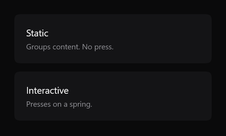
Groups content, or takes an onClick and presses on a spring. Both from the same file.
$ java -jar lamintra-0.5.0.jar add cardPreview
Rendered headlessly from LamintraCard.kt. Switch the scheme in the header and this changes with it: both are real renders of the same source rather than one filtered to look like the other.
Parameters
Read out of LamintraCard.kt when this page was built, not written by hand, so it cannot drift from the file the CLI installs. 1 required, 11 with defaults.
| Name | Type | Default |
|---|---|---|
modifier | Modifier | Modifier |
onClickwhen non-null the card becomes interactive | (() -> Unit)? | null |
enabledonly meaningful when onClick is non-null | Boolean | true |
colorssee LamintraCardColors; defaults to following the system | LamintraCardColors | LamintraCardColors.auto() |
cornerRadius16dp is the container value, against the capsule actions | Dp | 16.dp |
contentPaddingdefaults to none, because the common case is a card holding rows that pad themselves | PaddingValues | PaddingValues(0.dp) |
pressScalesubtler than a button's, because the card is much larger and the same ratio would read as the whole page lurching | Float | 0.985f |
disabledAlpha | Float | 0.3f |
borderWidth | Dp | 1.dp |
focusRingGap | Dp | 4.dp |
focusRingWidth | Dp | 2.dp |
contentrequired | @Composable ColumnScope.() -> Unit | - |
What lands in your project
3 files, written under your own package. The internals are namespaced per component (internal/card/), which is what lets two components ship same-named helpers without colliding.
LamintraCard.ktinternal/card/Squircle.ktLamintraTheme.kt
Source
The whole file, verbatim. This is the component: there is nothing behind it, no artifact to depend on, and deleting Lamintra afterwards leaves it compiling.
package com.lamintra.card

import androidx.compose.animation.core.animateFloatAsState
import androidx.compose.animation.core.spring
import androidx.compose.foundation.clickable
import androidx.compose.foundation.interaction.MutableInteractionSource
import androidx.compose.foundation.interaction.collectIsFocusedAsState
import androidx.compose.foundation.interaction.collectIsPressedAsState
import androidx.compose.foundation.layout.Column
import androidx.compose.foundation.layout.ColumnScope
import androidx.compose.foundation.layout.PaddingValues
import androidx.compose.foundation.layout.fillMaxWidth
import androidx.compose.foundation.layout.padding
import androidx.compose.runtime.Composable
import androidx.compose.runtime.getValue
import androidx.compose.runtime.remember
import androidx.compose.ui.Modifier
import androidx.compose.ui.draw.drawBehind
import androidx.compose.ui.graphics.Color
import androidx.compose.ui.graphics.drawscope.Stroke
import androidx.compose.ui.graphics.drawscope.translate
import androidx.compose.ui.graphics.graphicsLayer
import androidx.compose.ui.unit.Dp
import androidx.compose.ui.unit.dp
import com.lamintra.theme.LamintraColors
import com.lamintra.theme.LamintraTheme
import com.lamintra.theme.lamintraDarkColors
import com.lamintra.theme.lamintraLightColors
import com.lamintra.card.internal.card.Squircle

/**
 * Colours for [LamintraCard].
 *
 * The three factory names - `dark()`, `light()`, `auto()` - are identical on
 * every Lamintra component on purpose. They are the migration seam: a future
 * shared token layer changes only what `auto()` reads, without touching a
 * single call site. Do not rename them.
 */
data class LamintraCardColors(
    val fill: Color,
    val border: Color,
    val focus: Color
) {
    companion object {
        /** Maps the shared semantic layer onto this component's own slots. */
        fun from(colors: LamintraColors): LamintraCardColors = LamintraCardColors(
            fill = colors.container,
            // A card separates from the page by value alone. The border exists
            // as a parameter for hosts whose background sits too close to the
            // fill, not as part of the default look. Transparent is not a token
            // and never will be: it is the absence of one.
            border = Color.Transparent,
            focus = colors.focus
        )

        fun dark(): LamintraCardColors = from(lamintraDarkColors())

        fun light(): LamintraCardColors = from(lamintraLightColors())

        /**
         * Follows the device's colour scheme. Reads the *device* setting, not
         * your app's theme - an app that forces its own scheme should pass
         * [dark] or [light] explicitly.
         */
        @Composable
        fun auto(): LamintraCardColors = from(LamintraTheme.colors)
    }
}

/**
 * A grouping surface.
 *
 * Whether it is interactive is decided by [onClick], not by a variant
 * parameter: given one, the card presses like a button - scaling on a spring -
 * and gains a focus contour. Given none, it is inert and simply groups content.
 *
 * Silhouette carries role: containers are tight rectangles against the capsule
 * actions, so with colour removed you can still tell what is pressable.
 *
 * The content slot is never coloured or styled by this component. Text inside a
 * card belongs to the caller.
 *
 * @param onClick when non-null the card becomes interactive
 * @param enabled only meaningful when [onClick] is non-null
 * @param colors see [LamintraCardColors]; defaults to following the system
 * @param cornerRadius 16dp is the container value, against the capsule actions
 * @param pressScale subtler than a button's, because the card is much larger
 *        and the same ratio would read as the whole page lurching
 * @param contentPadding defaults to none, because the common case is a card
 *        holding rows that pad themselves
 */
@Composable
fun LamintraCard(
    modifier: Modifier = Modifier,
    onClick: (() -> Unit)? = null,
    enabled: Boolean = true,
    colors: LamintraCardColors = LamintraCardColors.auto(),
    cornerRadius: Dp = 16.dp,
    contentPadding: PaddingValues = PaddingValues(0.dp),
    pressScale: Float = 0.985f,
    disabledAlpha: Float = 0.3f,
    borderWidth: Dp = 1.dp,
    focusRingGap: Dp = 4.dp,
    focusRingWidth: Dp = 2.dp,
    content: @Composable ColumnScope.() -> Unit
) {
    val interaction = remember { MutableInteractionSource() }
    val pressed by interaction.collectIsPressedAsState()
    val focused by interaction.collectIsFocusedAsState()
    val interactive = onClick != null

    val scale by animateFloatAsState(
        targetValue = if (pressed && enabled && interactive) pressScale else 1f,
        animationSpec = spring(dampingRatio = 0.72f, stiffness = 1400f)
    )

    Column(
        modifier = modifier
            .fillMaxWidth()
            .graphicsLayer {
                scaleX = scale
                scaleY = scale
                alpha = if (enabled || !interactive) 1f else disabledAlpha
            }
            .drawBehind {
                val radius = cornerRadius.toPx()
                val path = Squircle.path(size.width, size.height, radius)

                if (focused && enabled && interactive) {
                    val pad = focusRingGap.toPx()
                    val ring = Squircle.path(
                        size.width + pad * 2, size.height + pad * 2, radius + pad
                    )
                    translate(left = -pad, top = -pad) {
                        drawPath(ring, colors.focus, style = Stroke(focusRingWidth.toPx()))
                    }
                }

                drawPath(path, colors.fill)
                if (colors.border != Color.Transparent) {
                    drawPath(path, colors.border, style = Stroke(borderWidth.toPx()))
                }
            }
            .then(
                if (onClick != null) {
                    Modifier.clickable(
                        interactionSource = interaction,
                        indication = null,
                        enabled = enabled,
                        onClick = onClick
                    )
                } else {
                    Modifier
                }
            )
            .padding(contentPadding),
        content = content
    )
}
Next
The command above assumes the project has been set up once already. If it has not, the install page covers what init detects and writes, and what to do when it guesses wrong.
The other components: button, text field, list row, switch, segmented.